For information on other forms of on-screen help, see popover and hint.
Usage
Use tooltips to:
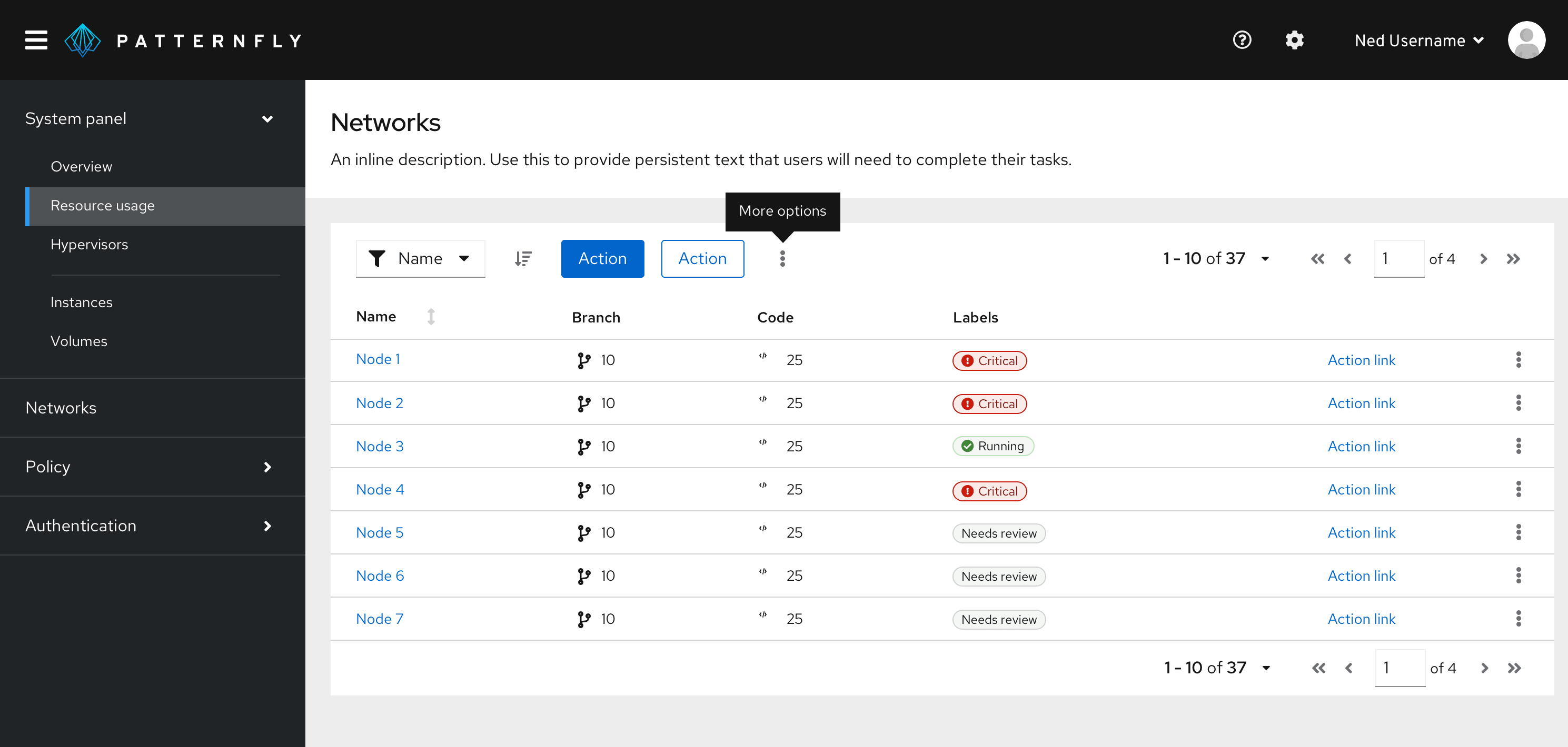
Provide labels for unlabeled icons.

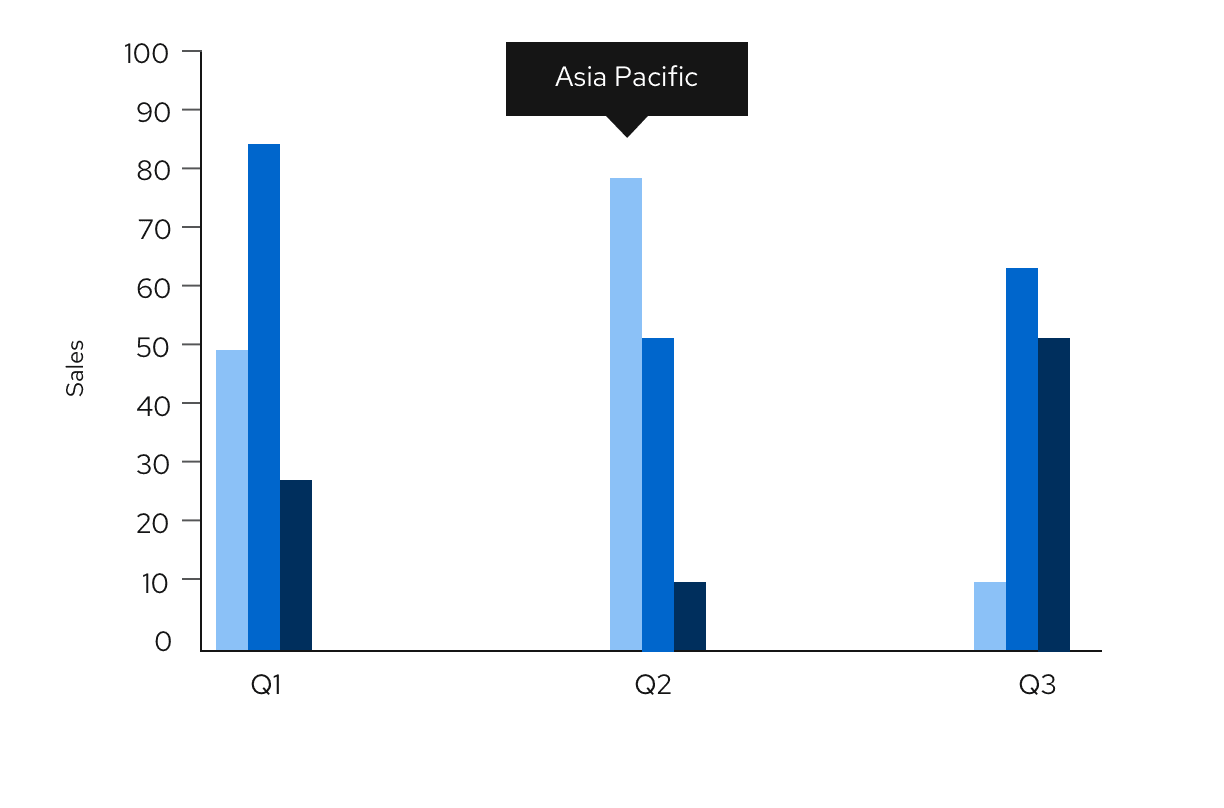
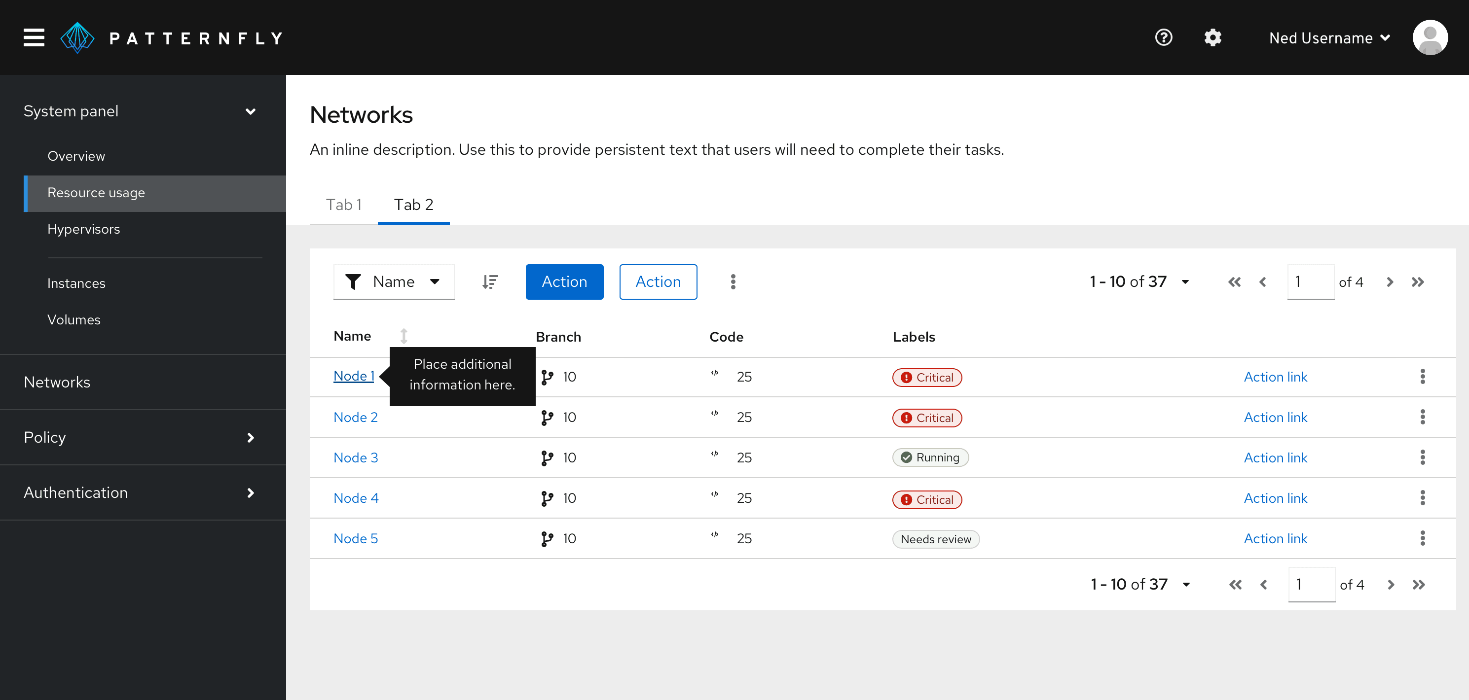
Provide additional information on a data point or element in a chart or table.

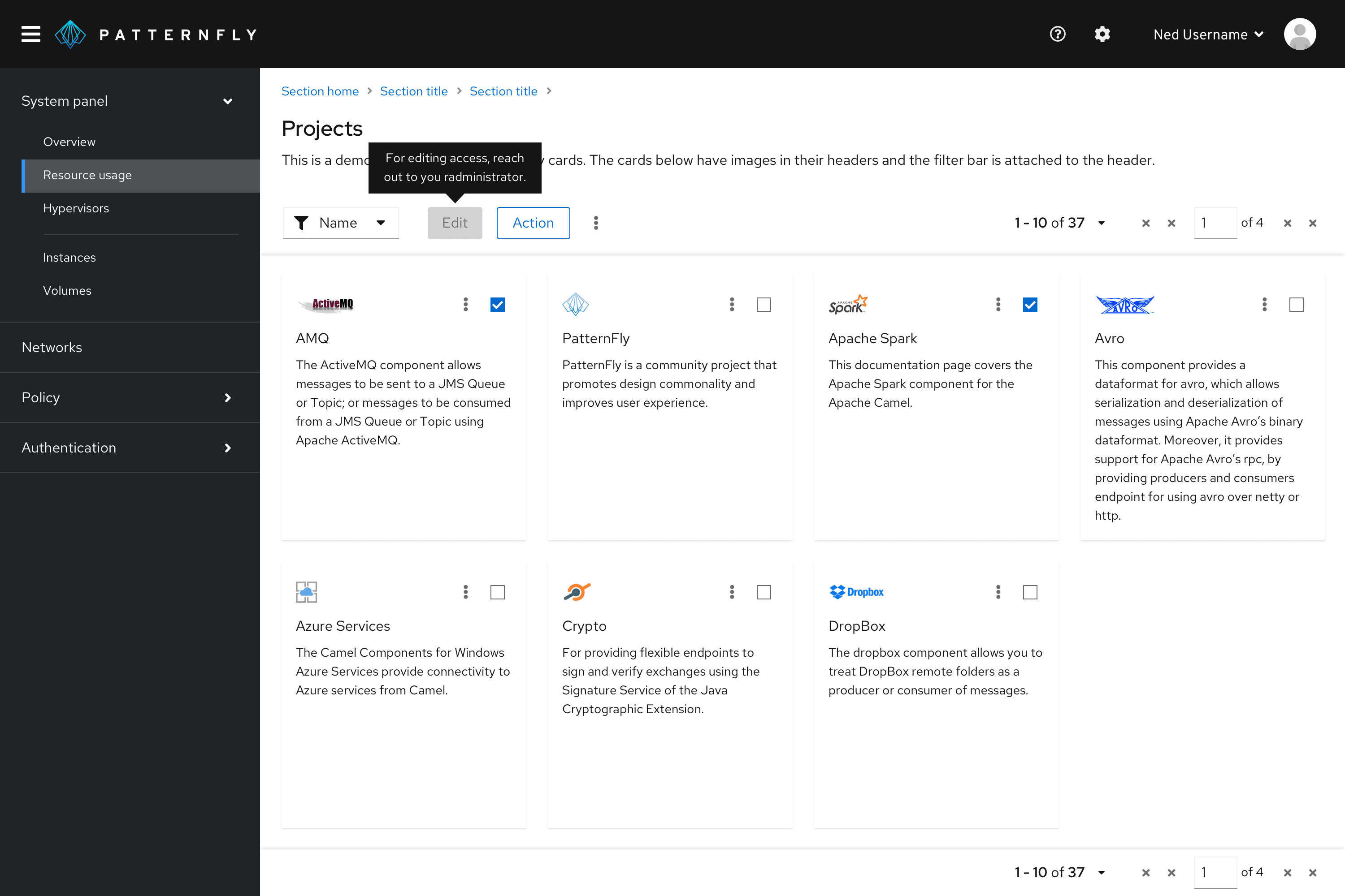
Define new or unfamiliar UI elements that aren’t described directly in the user interface. For example, you can use a tooltip on a disabled button.

Provide additional information on text or labels on hover. A way for users to see more information before clicking the element and being directed to a new page or producing an action on the page.

Tooltip delay on hover
By default, tooltips have a 300ms entry delay when hovering over an object. Although this is the recommended delay time, you may customize it via prop. For example, if you have a tooltip on an icon, and you would like for it to appear immediately on hover, you may set the delay to 0 ms.
When to use tooltips vs. popovers
Both tooltips and popovers provide more information in context for users. However, they’re different in a few ways:
- Tooltips are used for identification purposes, while popovers are used for added description or information in context.
- Tooltips contain short descriptions or labels, while popovers contain longer descriptions, formatted text, and optional images or links.
- Tooltips appear on hover, while popovers appear on click.
Content considerations
For content guidance, refer to our tooltip writing guide.
Accessibility
For information regarding accessibility, visit the tooltip accessibility tab.
View source on GitHub

