Usage
It is assumed that when a user toggles a switch, the change will save automatically without the need for additional action (like clicking a "Save" button).

- Form label: Indicates what the switch turns on or off
- Switch label: Indicates whether the switch itself is turned on or off
- Switch without label: Indicates the state of a switch with a checkmark inside the switch itself, used in place of a switch label
- Switch with label and checkmark: Indicates the state of a switch with a checkmark inside the switch itself and label with additional message
All switch types display their state (on or off) through different methods and locations. A basic switch communicates its state with an exterior switch label added to its right, while a switch without a label uses a checkmark to communicate its state from inside the switch itself.
General guidelines
- Use a basic switch by default unless space is limited, then use a switch without a label.
- Add a form label in front of your switch to specify what setting a switch turns on or off, such as Wi-fi or Bluetooth.
- If you're using a basic switch, add switch labels to clarify between toggled settings, such as On and Off.
- Don't include the state of a switch in a label if you're using a switch with a label and a checkmark.
- Don’t use a switch if the options you’re presenting to the user are anything other than “on” or “off.” Instead, use radio buttons.
When to use switches versus checkboxes
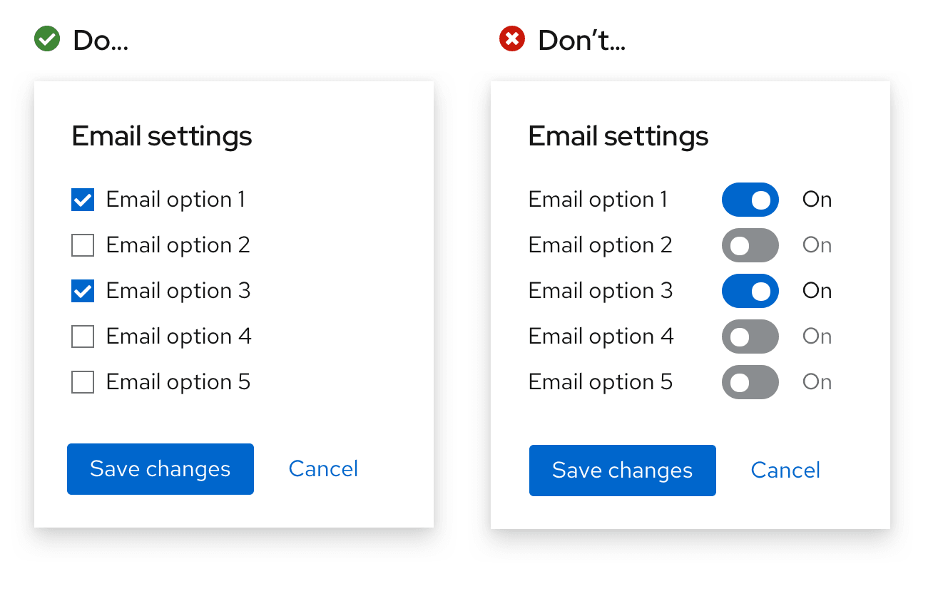
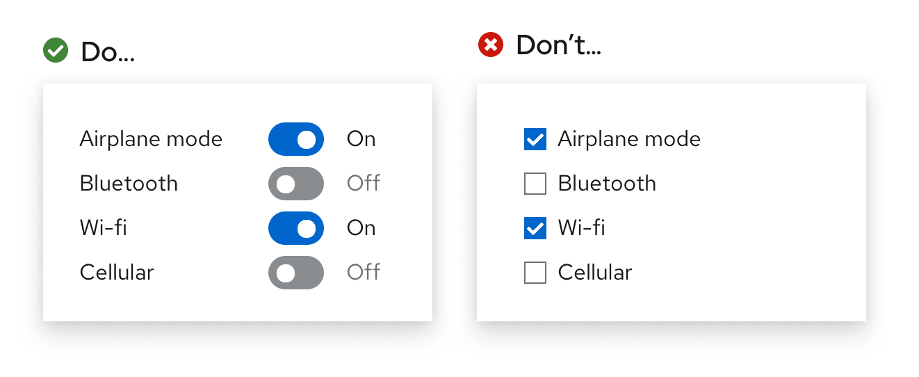
A switch changes an option and saves it simultaneously, while checkboxes require a separate action to save the selection, such as pressing a “Submit” or “Save” button.
Follow these guidelines for when to use a switch versus a checkbox:
Use checkboxes when options do not save automatically and require the user to perform an additional action to save changes (in this case, pressing the “Save changes” button).

Use a switch for situations where you are turning a series of one or more independent options on or off.

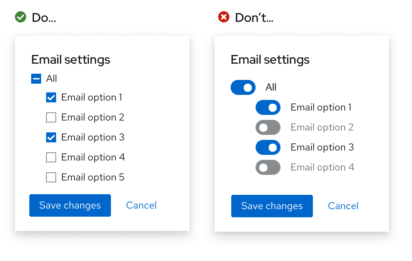
Use checkboxes when you may have an intermediate state where you can select all, none, or some actions.

Content considerations
Form labels
When writing form labels, keep the message short and specific. Ensure that the message is clear when the switch is toggled to both the “on” and “off” position.
Do | Don’t |
|---|---|
Encrypt installed disks | Enabled encryption of installed disks |
In this example, “Enabled encryption of installed disks” implies that enabled encryption is on, despite what position the switch is in. When the user toggles the switch to “off”, the form label “Enabled encryption of installed disks” could make them second-guess whether or not encryption is actually enabled. “Encrypt installed disks” makes sense when the option is both enabled and disabled, and does not imply that it is “on” or “off”.
Do | Don’t |
|---|---|
Bluetooth | Turn on bluetooth |
Notifications | Turn off notifications |
Admin edit permission | Give admins edit permissions |
Punctuation
Keep labels short and clear. Avoid end-of-sentence punctuation such as question marks or exclamation points.
Do | Don’t |
|---|---|
Automatically refresh | Refresh automatically? |
Data collection | Allow data collection? |
Notifications | Turn off notifications. |
View source on GitHub

